userstyles
my userstyles repo
:warning: temporarily not maintained
Sorry, I don’t have time at the moment to maintain this project due to my busy schedule. You can fork it and make changes that suit your needs to continue using it. You can also then propose these changes with a pull request. I will try to find time to review it and accept it if it fits the current goals of the project.
about
this is the repo of my userstyles.
license
platform
external repos
[ ](https://openusercss.org/profile/5e90dfa66618400c009af3dd “openusercss ](https://openusercss.org/profile/5e90dfa66618400c009af3dd “openusercss |
almaceleste”) |
[ ](https://greasyfork.org/en/users/174037-almaceleste?language=css “greasyfork.org ](https://greasyfork.org/en/users/174037-almaceleste?language=css “greasyfork.org |
almaceleste”) |
[ ](https://userstyles.org/users/903337 “userstyles.org ](https://userstyles.org/users/903337 “userstyles.org |
almaceleste”) |
list of styles
 4pda.ru Forum Tweaks
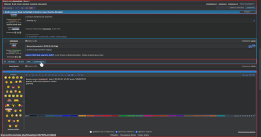
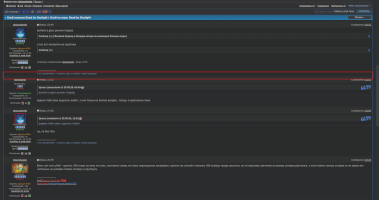
![]()
makes the forum more compact, convenient and interactive. this style does not change the background, buttons and other parameters of the site’s appearance, only functionality, so that it can be used in conjunction with other custom styles.
- the site header is sticky now so you have access to important links all the time
- a quick reply box is docked at the bottom so you can scroll through messages, embed quotes from them and edit your answer at the same time
- the topic messages have a compacted view now: the margins are minimized and the message buttons are hidden until you hover your mouse over the message
- the user avatar is smaller now to make the message more compact - but it will become larger when you hover over it
- some other elements are more interactive
- forum section headers are now available until they scroll completely
- popup menu items are now clickable along the entire length
- post buttons are now located on the popup panel (in the settings you can change the location of the panel or switch to the classic view)
- use the settings menu to change the highlight color and other options on your choice.
 MI-R3G Padavan Tweaks
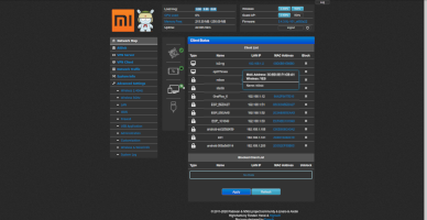
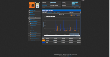
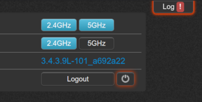
fixes and improvements for MI-R3G router Padavan firmware
- fixed a dark theme that, to put it mildly, was not always dark. In addition, the Dark Reader browser extension is supported
- the color of the icons is correctly inverted, several types of inversion are added, so that you can choose the one suitable for all occasions
- added the ability to change the height of the frame in which the list of network clients is displayed (can be configured for any screen, but basically it is for the screen> 768 pixels in height)
- pop-up informational message no longer creeps out of the client list frame, which caused the scrollbar to appear earlier
- buttons and other interactive elements are highlighted when you hover, and the backlight has two types - normal and warning (you can choose colors or turn off)
- now only the part of the interface that contains a large amount of data is scrolled - the menu, top panel and tabs remain in place
- two ip settings: for wan ip and lan ip
- the main parameters of changes and innovations can be configured or disabled in the style settings menu
 Youtube Progress Bar Highlighting
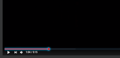
highlights the progress bar of the youtube player on hover
- use the settings menu to change the highlight color on your choice.
 Youtube Controls Highlighting
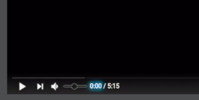
highlights the controls of the youtube player to the preferred color on hover
- use the settings menu to change the highlight color on your choice.
 Youtube Bottom Gray Shadow
changes a white shadow background of the Youtube Player’s bottom to the gray color and adds some additional shadows to the bottom controls to increase readability
- use the settings menu to change the shadow color on your choice.
 Stylus Theme (Dark Side)
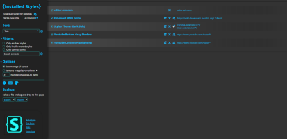
this style is a remastered and improved style from the Stylus Theme (Dark).
muchas gracias for Randy W. Sims, an author of it, for his huge work, which help us to save our eyes from the ruinous light.
‘Come to the Dark Side’ - Darth Vader
this style goes well with the darcula theme of the editor, imho.
but feel free with your own experiments.
- fixed: searchbox textarea height and cursor
- use the settings menu to change the highlight color on your choice.
 MDN Editor (Gray Toolbox)
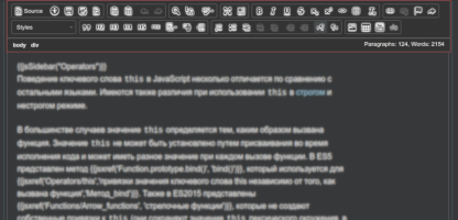
paints the MDN Editor’s right and left toolboxes and the comment tool to the gray color.
- use the settings menu to change the background and foreground colors on your choice.
 MDN Editor (UI Tweaks)
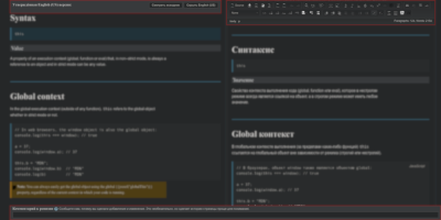
tweaks for the UI of the MDN Editor.
- the left panel with the
SourceandHidebuttons is changed to position sticky to prevent sliding above - the comment section is changed to be more compact and position absolute thus you could fill it while you edit the article
- so the useful things are always at hand
- source area settings: background color, font color, font family, font size
- use the settings menu to change the colors and other on your choice


